UX Research for Sales Campaign
Campaign Strategy and Design for E-commerce Platform for Ageing Female population in North America
Summary
This project reinforced the value of age-responsive UX; designing with cognitive and emotional comfort in mind. It also showed the impact of building modular systems that support business agility during seasonal peaks.
Role :
UX Research I Visual UI Design I Art Direction I A/B Testing
Team :
Sanskruti Shukla (Me) and Manager, Ayuttva Team ( 4 copywriters, 2 Designers)
In synergy with Media Buying Team, Email Team,
For :
Transformative Learning Solutions I The Ayurveda Experience.
OVERVIEW
This project reinforced the value of age-responsive UX; designing with cognitive and emotional comfort in mind. It also showed the impact of building modular systems that support business agility during seasonal peaks.
In a fast paced enviornment -
harnessing through product launch for the North American during time sensitive promotional period targetting subscribers and first time buyers to interact and convert to buyers.
IMPACT
+ Increased CTR by ~ 4% and 12%
on campaign emails compared to the previous quarter.
+ Increased CVR by ~ 4%
on campaign emails compared to the previous quarter.
+ Raised AOV by ~12%
by strategically placing product bundles and timers.
+ Reduced Bounce Rate
on landing pages through more intuitive page layout and prioritisation of key CTAs.
ROLE
+ Led user research and insight synthesis to define key challenges and focus areas.
+ Worked across teams to align product, marketing, and user goals.
+ Designed core UI/UX flows to reduce friction, promote upsells, and build trust.
CHALLENGES
This project tackles core challenges in the user journey, building trust beyond discounts, reducing friction in purchase flows, promoting strategic upsells, and crafting product-specific visuals.
Each focus area is rooted in real user behavior and designed to drive clarity and conversion.
Focus Area I
Communicating Non-Monetary Value Clearly
How might we help users be trustful of the benefits, credibility, and quality of products; beyond just price and discount?
Focus Area II
Reducing Friction in the Purchase Journey
How might we streamline the path to purchase; minimising the number of steps while still educating the user enough to build trust?
Focus Area III
Strategic Upselling for Increased Conversion Rate %
How might we promote add-on products or bundles at the right stage;
post-purchase or at checkout without causing drop-offs?
Focus Area IV
Driving Action with Product-Specific Creative Hooks
How might we design high-conversion visuals (motion, microcopy, icons) that communicate the distinct benefits of each supplement quickly?
WHO IS THE USER
The customer base of TAE falls under the demographic of
→ American Women
→ Middle aged to Older women
→ Health Conscious
→ Avid readers
→ Prefer self diagnosis over professional
→ Supplements over medicines.
→ Use mobile phones over laptops
→ Activity during sale period - Highest

Linda,
The Wellness Skeptic
Age: 56
Location: Michigan, USA
Occupation: Retired Nurse
Tech Comfort: Moderate (iPad and phone)
Health Priorities:
Bone strength, hormone balance, and gut health
Purchase Behavior: Cautious, relies on reviews + transparency
Digital Behavior:
Browses Pinterest, reads long-form blogs, watches testimonial videos
Triggers of Trust
🌿 Clinical backing
🌿 Clear before-after timelines
🌿 Accessible design: legiblility
Frustrations:
❌ Confusing checkout flows
❌ Hard-to-read; small text
❌ Overly salesy tone with little science

Dana
Value Seeking Buyer
Age: 56
Location: Michigan, USA
Occupation: Retired Nurse
Tech Comfort: Moderate (iPad and phone)
Health Priorities:
Bone strength, hormone balance, and gut health
Purchase Behavior: Cautious, relies on reviews + transparency
Digital Behavior:
Browses Pinterest, reads long-form blogs, watches testimonial videos
Triggers of Trust
🌿 Smooth and quick checkout
🌿 Real user reviews
🌿 transparency + sustainability
Frustrations:
❌ Hidden shipping fees/unclear discount logic
❌ Countdown timers ; triggering
❌ Digging for promo codes
WHO IS THE USER
DURING SALES?
🌟
Preference for Familiar or Recommended Products
During sales, users stick to what they know works + previously tried items or top-rated bestsellers.
Confusion or too many choices can lead them to default to single SKUs rather than explore new products."I’ll just restock my usual.
"I don’t have time to figure out the new one."
💸
Discount-First Decision Making
These users prioritize value-for-money, often scanning pages for visual cues like strikethrough prices, bundles, or “Buy 1 Get 1” offers.
They also appreciate transparent savings, such as cost per unit.
"How much am I really saving? Is the bundle worth it?"
🌀
Impatience with Long
Purchase Flows
Users feel overwhelmed or annoyed by multi-step checkouts or unclear navigation.
The more clicks between ad and cart, the higher the risk of abandonment ; especially if they’re returning buyers expecting a quick transaction.
“Why do I have to go through so many pages just to check out?”
🔍
Increased Sensitivity to Trust Signals
Despite urgency, older users tend to seek reassurance through clear product benefits, visible customer reviews, certifications, or endorsements.
A cluttered page or unclear offer can raise doubt and lead to abandonment.
"It’s a good deal but I need to be sure it actually works."
USER FLOW
This project reinforced the value of age-responsive UX; designing with cognitive and emotional comfort in mind.
It also showed the impact of building modular systems that support business agility during seasonal peaks.
.jpg)
USER JOURNEY MAPPING
This project reinforced the value of age-responsive UX; designing with cognitive and emotional comfort in mind.
It also showed the impact of building modular systems that support business agility during seasonal peaks.
.jpg)
User Journey : Touchpoints and Insights to evaluate opportunity areas
RESEARCH + ANALYSIS
COMPETITOR ANALYSIS
This project reinforced the value of age-responsive UX; designing with cognitive and emotional comfort in mind.
It also showed the impact of building modular systems that support business agility during seasonal peaks.

LEARNING FROM OTHERS
🧪 Evidence-backed messaging builds credibility:
anchor communication in clinical studies, third-party testing, and certifications; reinforcing non-monetary value through proof, not persuasion.
🪄 Micro-interactions nudge user decisions:
Goli and Care/of use lightweight animations and timed nudges (e.g.,Best paired with X”) that feel helpful rather than pushy, encouraging add-ons and bundle.
🛍️ Checkout is a conversion tool , not just a step:
Brands like Hims and Seed use the cart page to reinforce trust with refund policies, shipping clarity, and value reminders, reducing exit rates at a crucial decision point.
🧱 Segmented landing pages perform better:
Instead of one-size-fits-all messaging, top DTC brands create separate flows for new vs. returning users, or sale vs. subscription buyers, supporting divergent motivations with tailored content.
LOOKING INWARDS
🔄 Too many clicks frustrate users:
Prior funnel data revealed drop-offs in journeys longer than 3–4 steps especially among older users or mobile-first buyers.
📚 Users want substance, not hype:
Scroll behavior indicated that information-rich pages with clear breakdowns of ingredients and benefits saw deeper engagement.
🧾 Trust is earned, not claimed:
Users responded better to third-party reviews, certifications, and whitepapers over vague claims or unsubstantiated "doctor recommended" badges.
🎛️ Clarity of interface matters:
Font weight, button color, and hierarchy significantly impacted click-through rates : subtle shifts often led to measurable difference in interaction.
Focus Area I
Communicating Non-Monetary Value Clearly.
Solution : Created a detailed About section showcasing certifications, processing, and provenance to show transparency in information.
Transparency via About Page
with Process + Certifications
→ “Clinically Verified” tag, allowing users to access testing, sourcing, or efficacy documentation.
Wellness Framing over Cosmetic Positioning
→ Shifted brand language and imagery from beauty-oriented (skin-deep) to holistic health benefits: immunity, gut health, mental clarity.
Ingredient Transparency
→ Created easy-to-access ingredient sourcing breakdowns, not just what's in it, but why it's there and how it benefits the user.
Practitioner-Endorsed Claims
→ Highlighted expert endorsements or partnerships with healthcare advisors to strengthen non-promotional trust cues.


About Page in Mega Menu added
Repositioning to Wellness through microcopy to imagery
CTA to Explore Collection and Go back to Sales Page
Focus Area II
Reducing Friction in Purchase Journey
Solution : Streamline the path to purchase; minimising the number of steps while still educating the user enough to build trust?"
Shortened Add to Cart Flow
→ Showing the revised flow from ad to sales page to cart in fewer steps, with the CTA always within reach.
Contextual CTAs & Smart Defaults
Placed CTAs where intent is highest (ex. after benefit highlights) and used smart defaults (like pre-selected bestsellers or bundles) to ease decision-making and reduce drop-off.

Conveying value for each deal -
communicating categories of what the user may want based on purchase behaviour.
3 Deals for Buy Box
Reiterating for Recall
Visual reinforces text,
confirmation allows
user to act confidently, hence act fast.
Focus Area III
Reducing Friction in Purchase Journey
Solution : Streamline the path to purchase under 3 clicks for new buyers ; minimising the number of steps while still educating the user enough to build trust?"
Motion-based Product Ads
→ Animations or short explainer loops for Instagram, Meta, or DTC site, built around unique supplement goals (sleep, digestion, stress).
Custom Page + Microcopy for Conversion
→ Redesigned Sales Pages for customers after understanding behaviour on site through heatmaps. Clear, benefit-driven CTAs and snappy copy near key visuals.
Multiple CTAs to reduce downtime
→ Four CTAs per page, at end beginning of the first 2 folds to incite action.
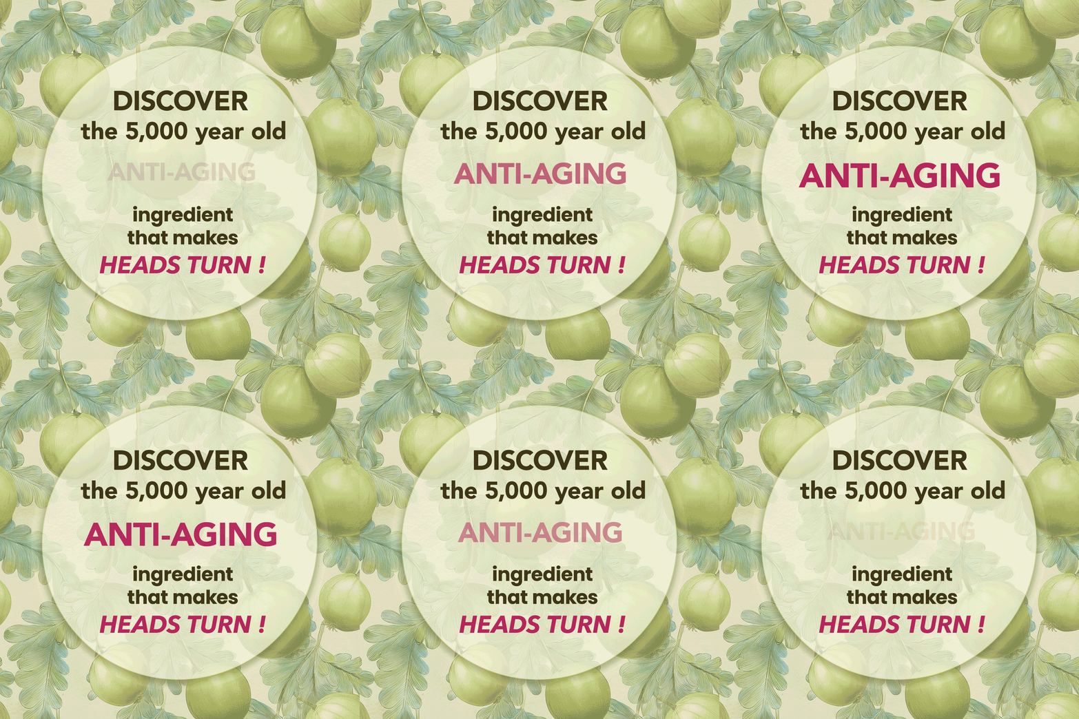
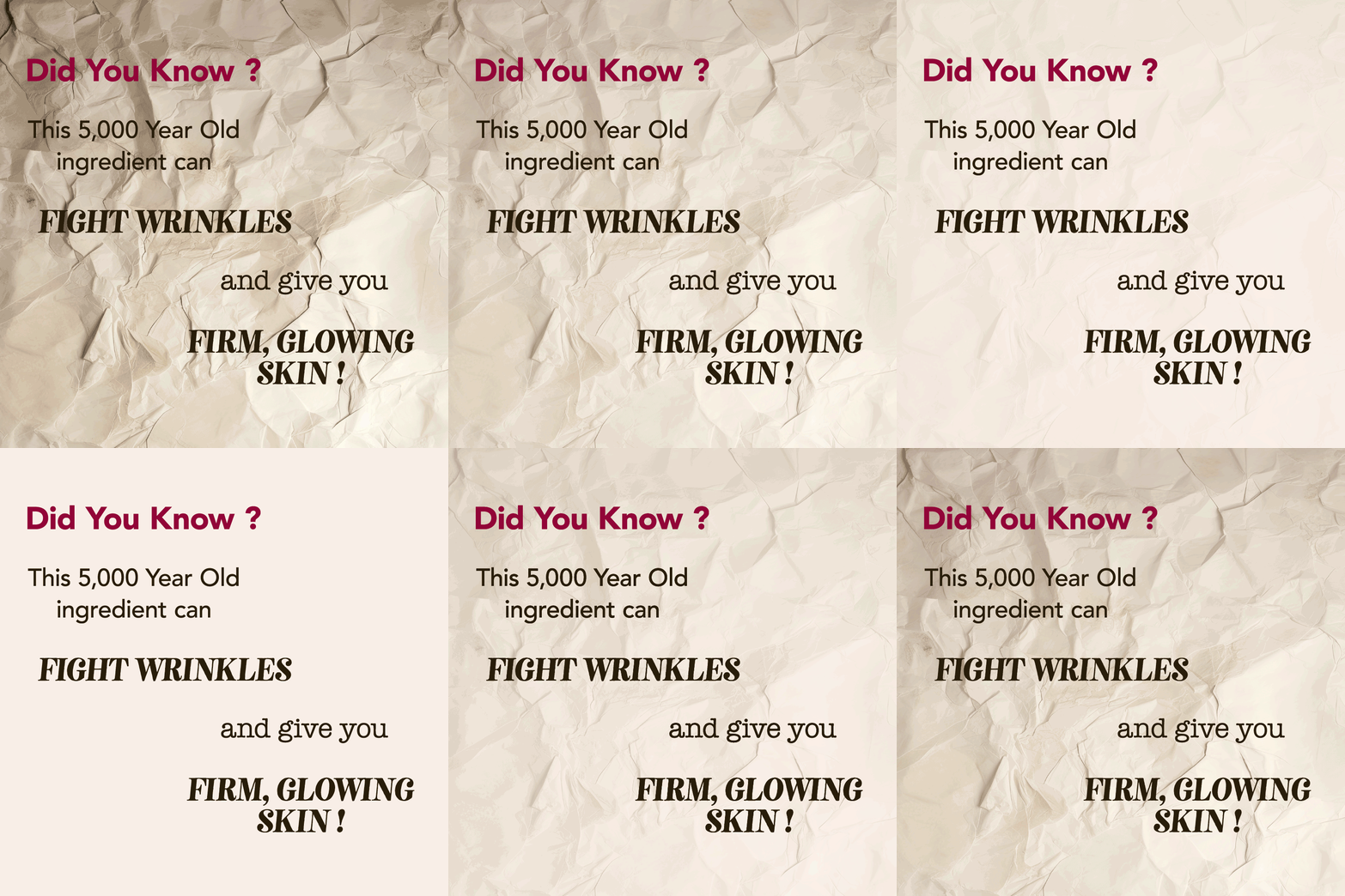
Best performing Ads used pre-launch.
Reused for Sale campaign due to high CTR

Based on user experience - motion captures attention - especially on FB Ads > Google Ads


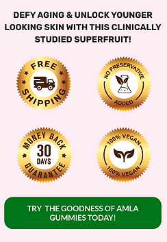
Sales Page - reinforcing product and service from first click; without causing user disorientation - reduces drop offs.
Multiple CTAs in the first 4 folds to ensure increased CTR


Automatically applying Free Gift on top of automated discounts.
Reduces hassle of coupon code.
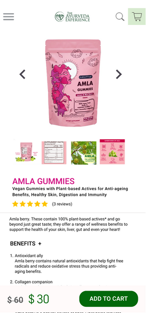
First fold with all info. No scroll -
Add product to card and proceed to Shopping cart

Back to product page. Multiple orders from one user - user behaviour observation to make use of sale period.
KEY EXPERIENCE HIGHLIGHTS
This project reinforced the value of age-responsive UX; designing with cognitive and emotional comfort in mind.
It also showed the impact of building modular systems that support business agility during seasonal peaks.


Process bar to signal the task/steps that are completed and remain


Process bar to signal the task/steps that are completed and remain
Automatic discount applied.
Total savings calculated for transparency.
Recurring reviews about product and brand experience

NOTES FOR FUTURE >
✅ Things that worked
Clarity in Visual Messaging
Contextual icons, motion elements, and concise microcopy helped communicate key product benefits quickly.
Smarter Purchase Flows
Streamlined navigation from
ad → product → cart reduced friction.
Clear CTAs
and fewer clicks encouraged completion without sacrificing product context.
Personalized Sales Experiences
Differentiated flows for returning customers vs. new users or discount-seekers led to better engagement.
Dynamic offers and bundles resonated with user intent.
🔄 Things that need work
Stronger Scientific Validation Cues
Though we highlighted quality and sourcing, users needed more overt signals — like third-party certifications, ingredient studies, or expert endorsements — to build full trust.
Upsell Timing and Placement
While upsells performed well post-purchase, during-checkout prompts occasionally distracted from conversion. More A/B testing could optimize placement and copy.
IMPACT >
+ Increased CTR by ~ 4% and 12% on campaign emails compared to the previous quarter.
+ Increased CVR by ~ 4% on campaign emails compared to the previous quarter.
+ Raised AOV by ~12% by strategically placing product bundles
+ Reduced Bounce Rate on landing pages through more intuitive page layout and prioritisation of key CTAs.